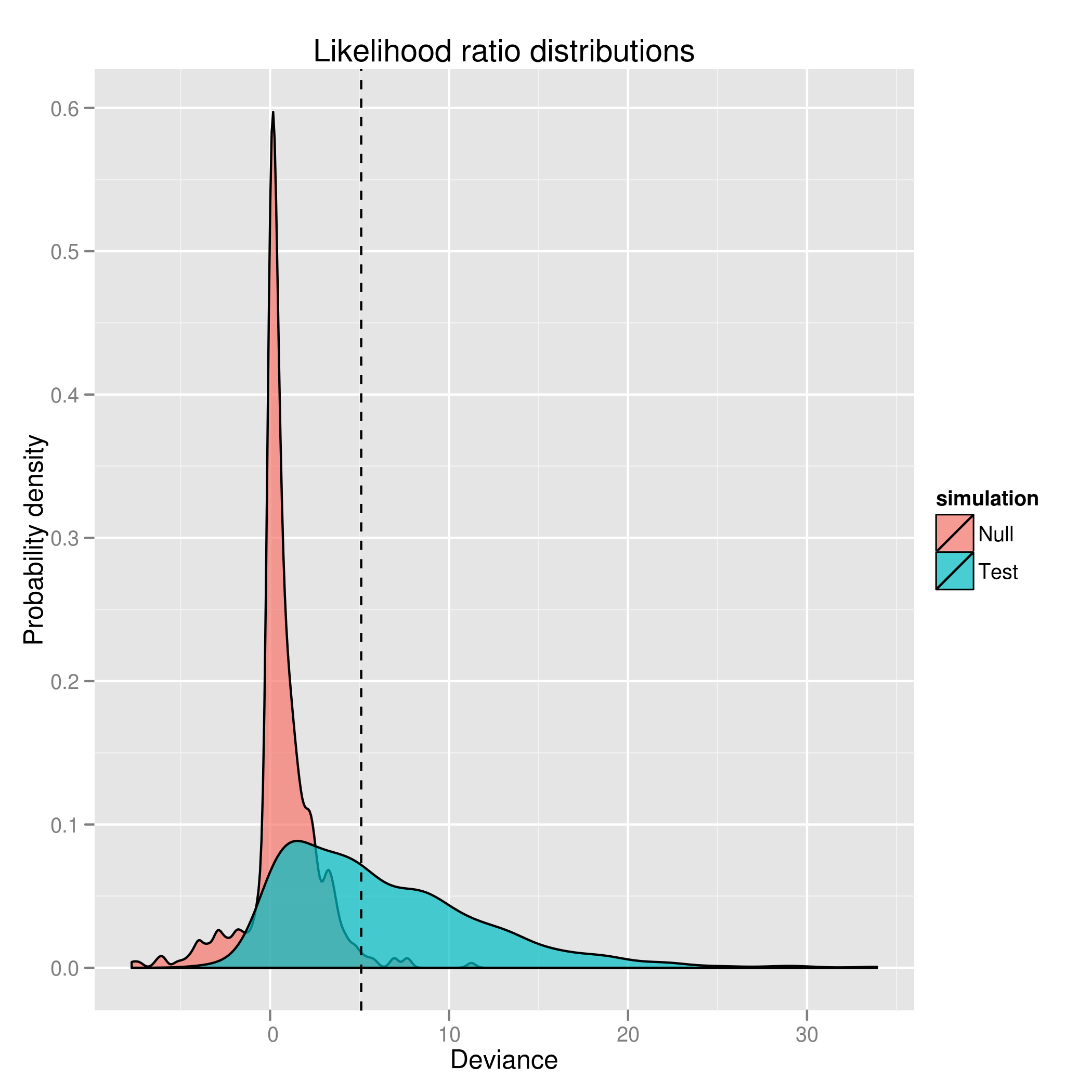
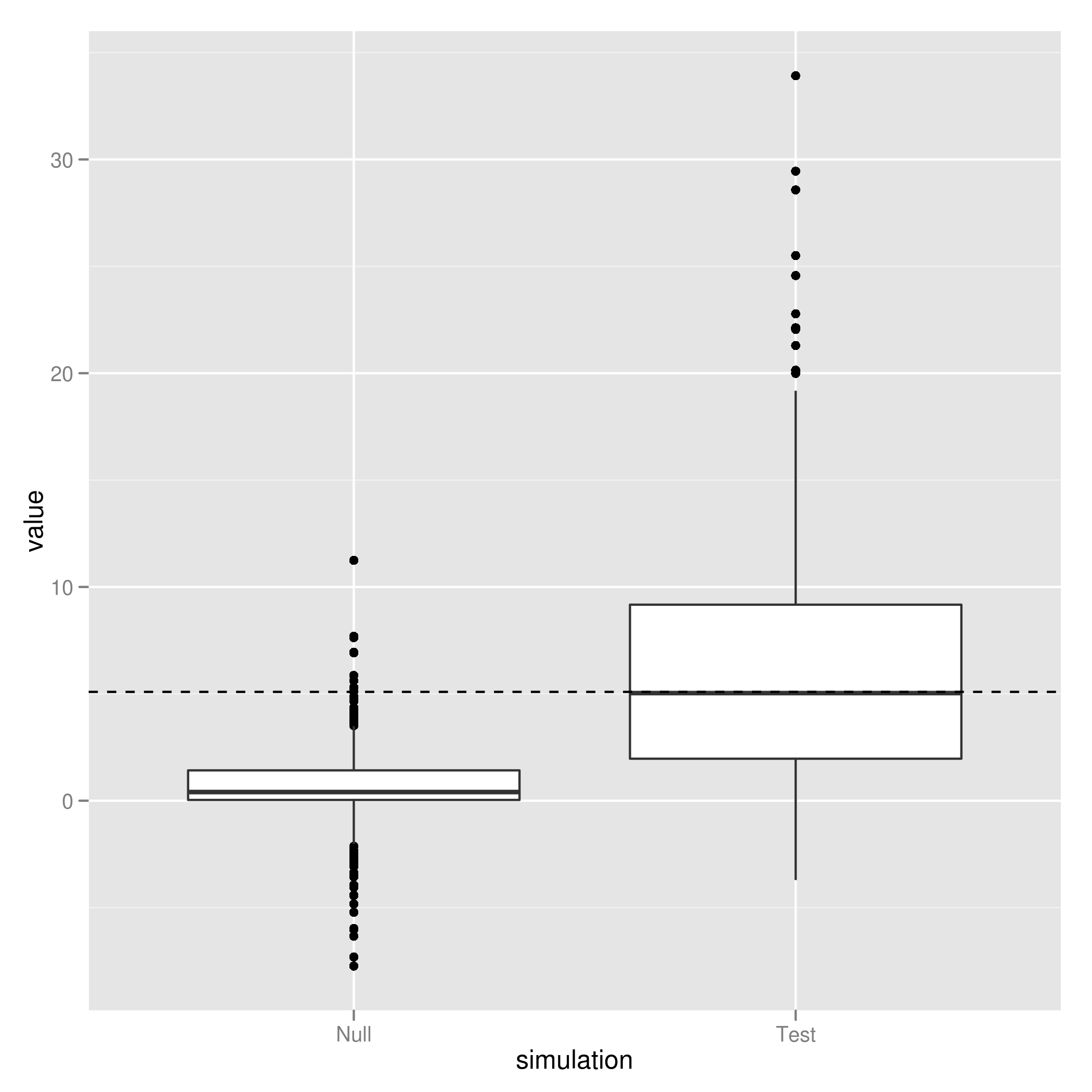
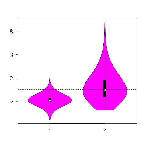
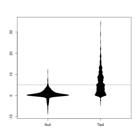
I spend a lot of time comparing distributions. There’s lots of different ways to visualize these comparisons, I’m not sure what is the most effective & intuitive way to indicate their overlap.
Distributions
Boxplot
Violinplot
Beanplot
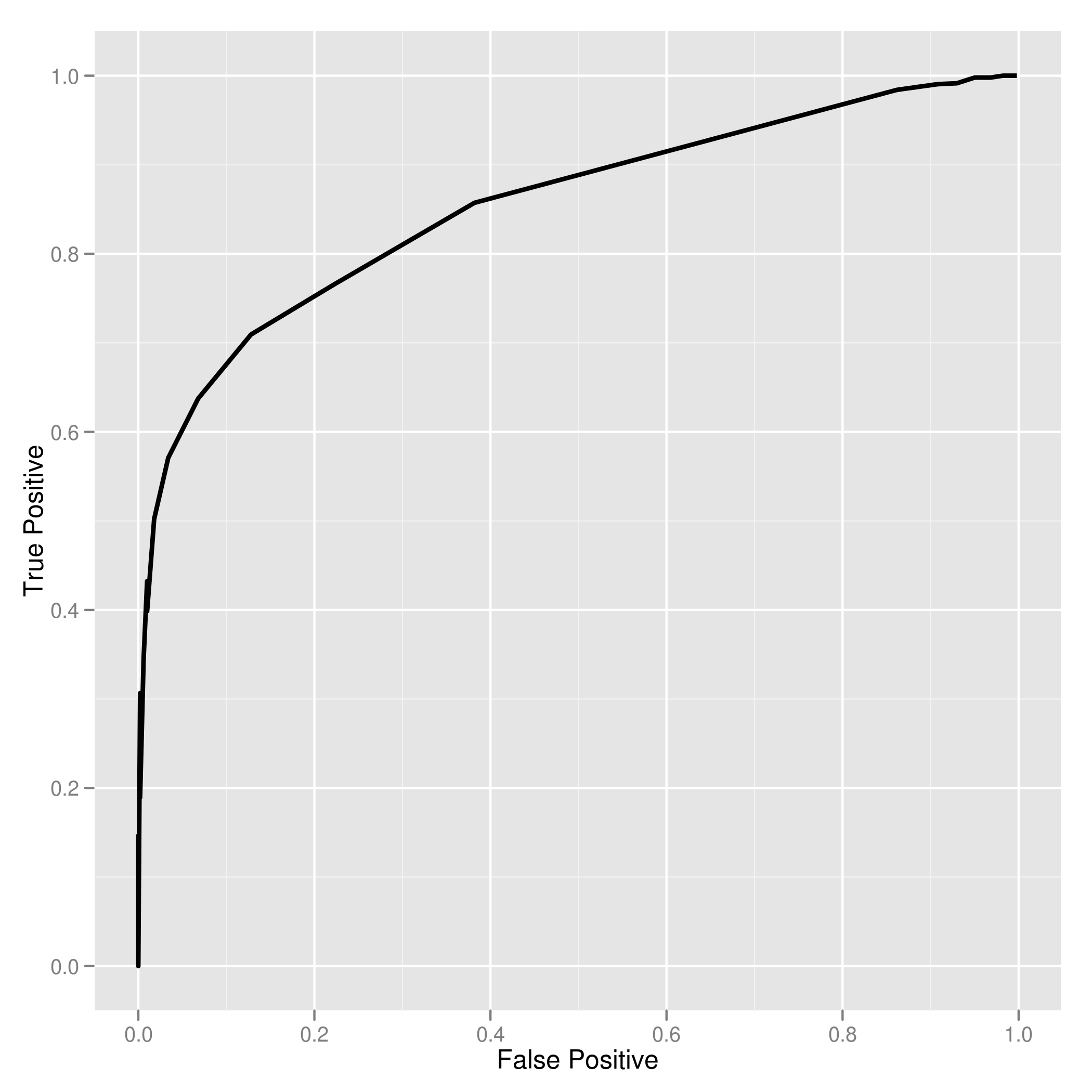
ROC Curve
These images in gallery format with examples from two other data sources as well (click on image to zoom into gallery).
[flickr-gallery mode=“search” tags=“warningsignals” min_upload_date=“2012-02-03 00:00:00” max_upload_date=“2012-02-03 11:00:00”]