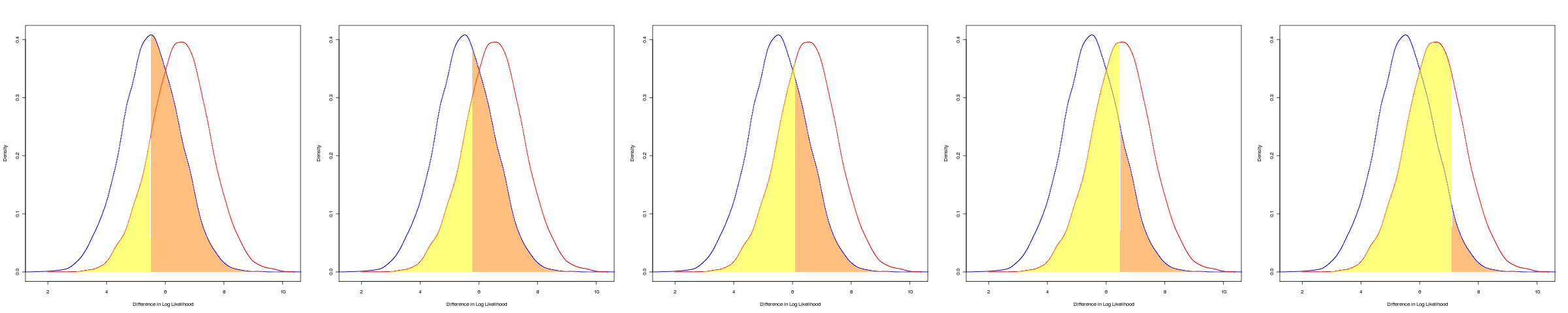
Looking at ways to visually explain receiver-operator characteristic (ROC) curves. Should probably be done in a way that maps the curves to the points along the curve. May make a nice graphic but perhaps unnecessary.
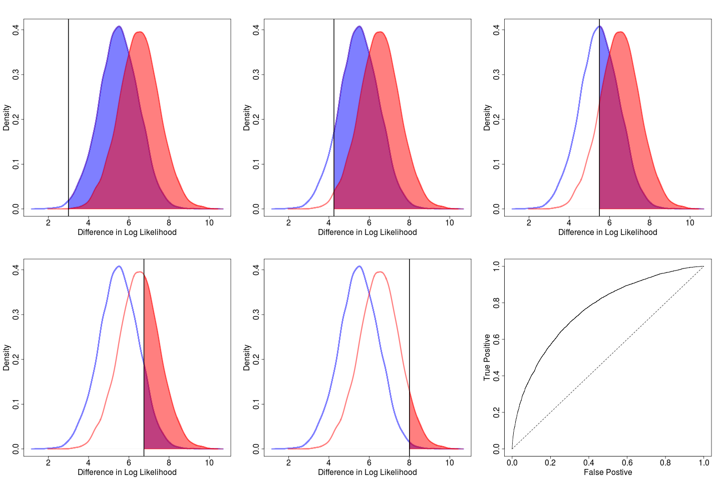
Perhaps simpler to present as single panel 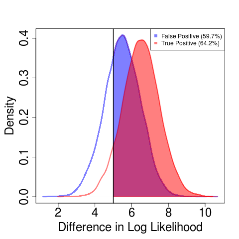
Integrating the test distribution to the left instead of the right gives the error rate (Type I/Type II errors, False Alarms/Missed Events):
Analyses
Maximization algorithm failing at initial conditions on deut2
Re-running deut1 and deut3 with more replicates and finer resolution on the effect of increased sampling.
Misc
Posted Evolution conference notes.
Still have to post ievobio notes.